
What was the challenge?

How did we approach it?

What did we do about it?

What were the key features?
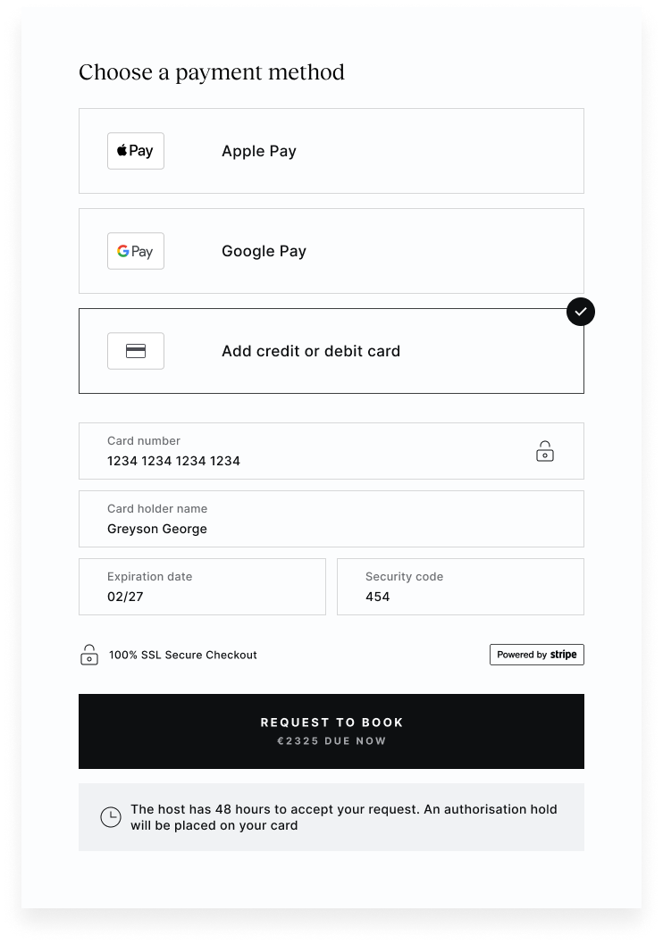
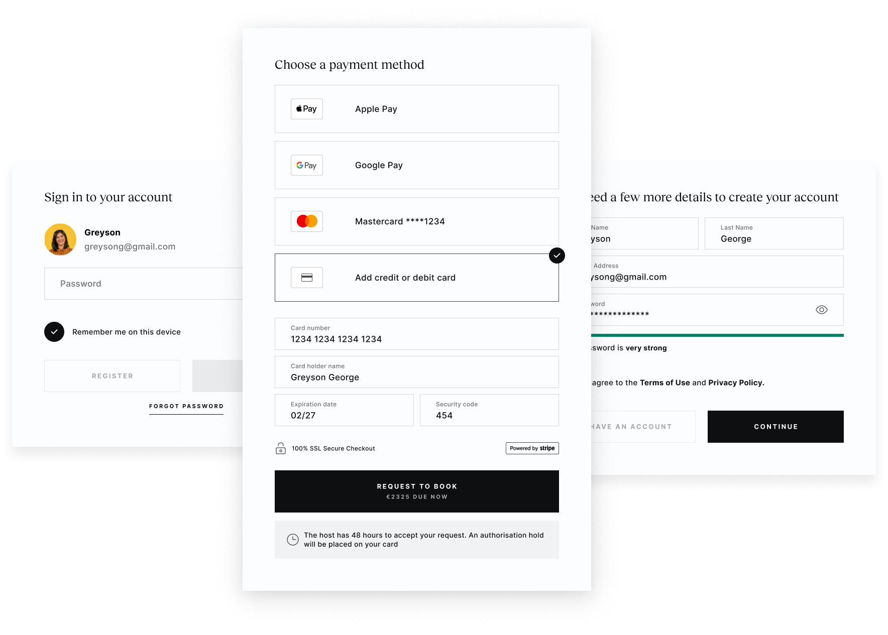
More (payment options) is less (friction)


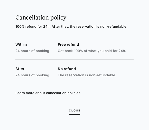
Late night bookings
What was the challenge?
How did we approach it?
What did we do about it?
What were the key features?