
What we accomplished

What were our challenges?

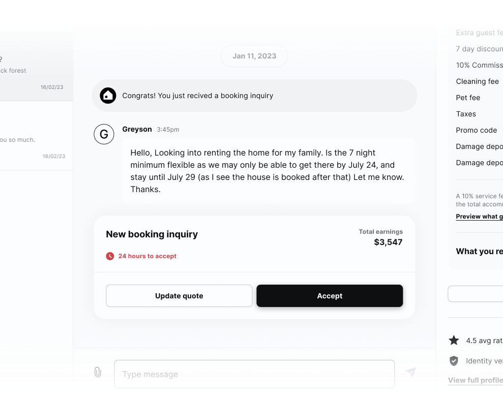
First look
How did we handle it?


What did it look like in the end?
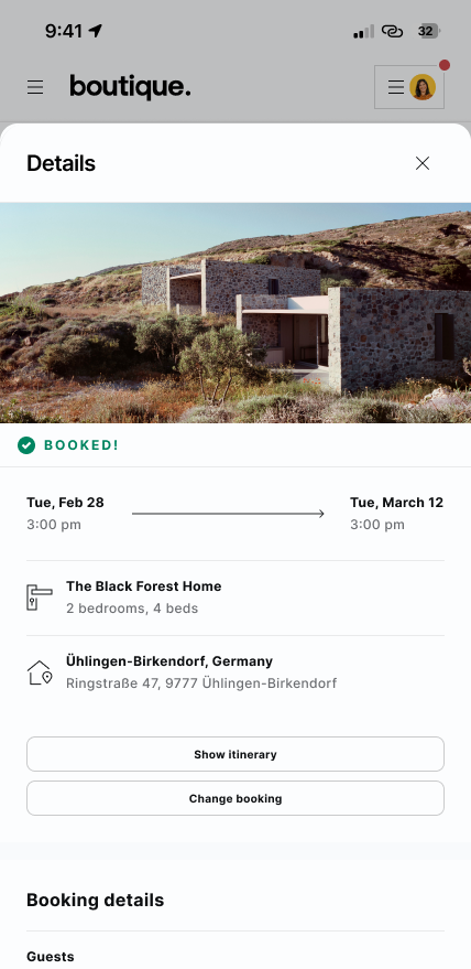
Manage your trip anywhere...
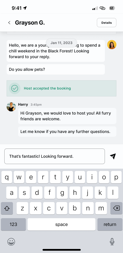
... and anytime


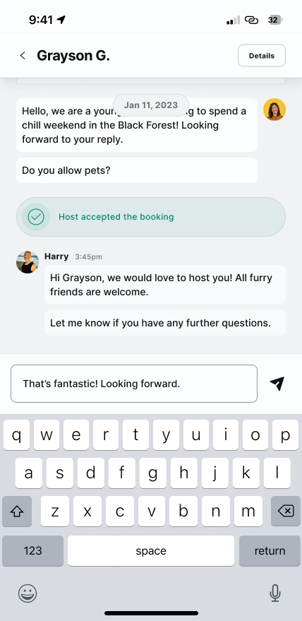
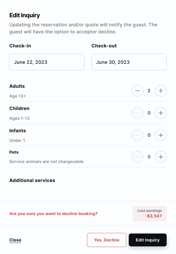
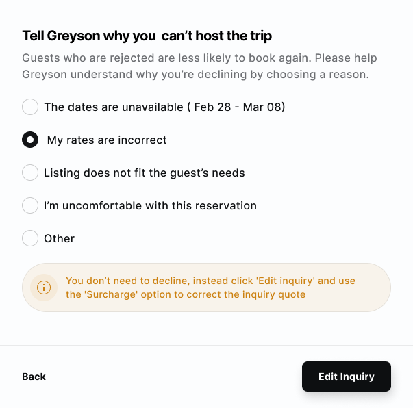
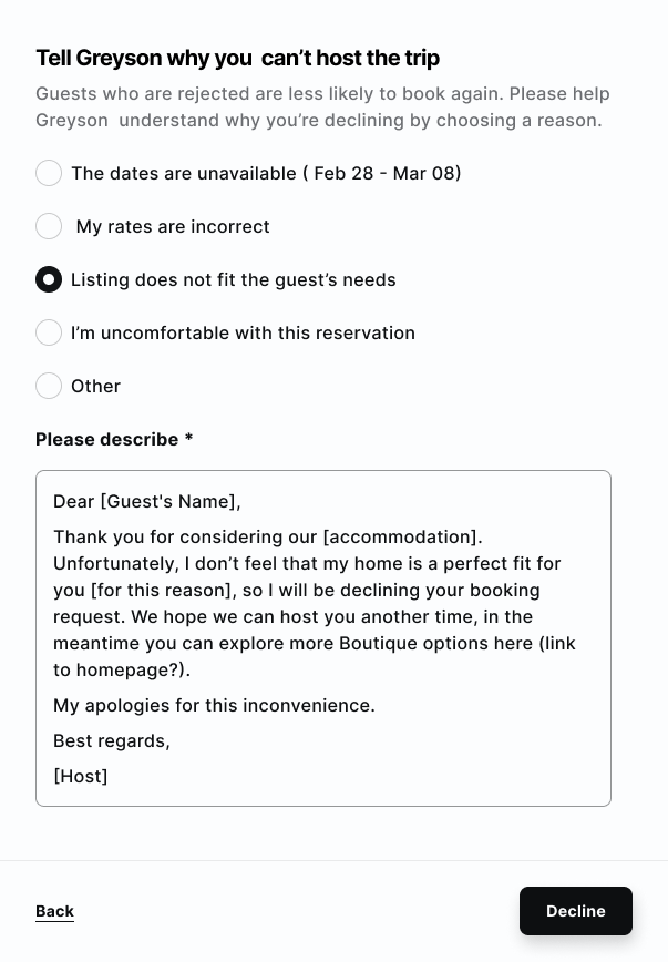
Guided management
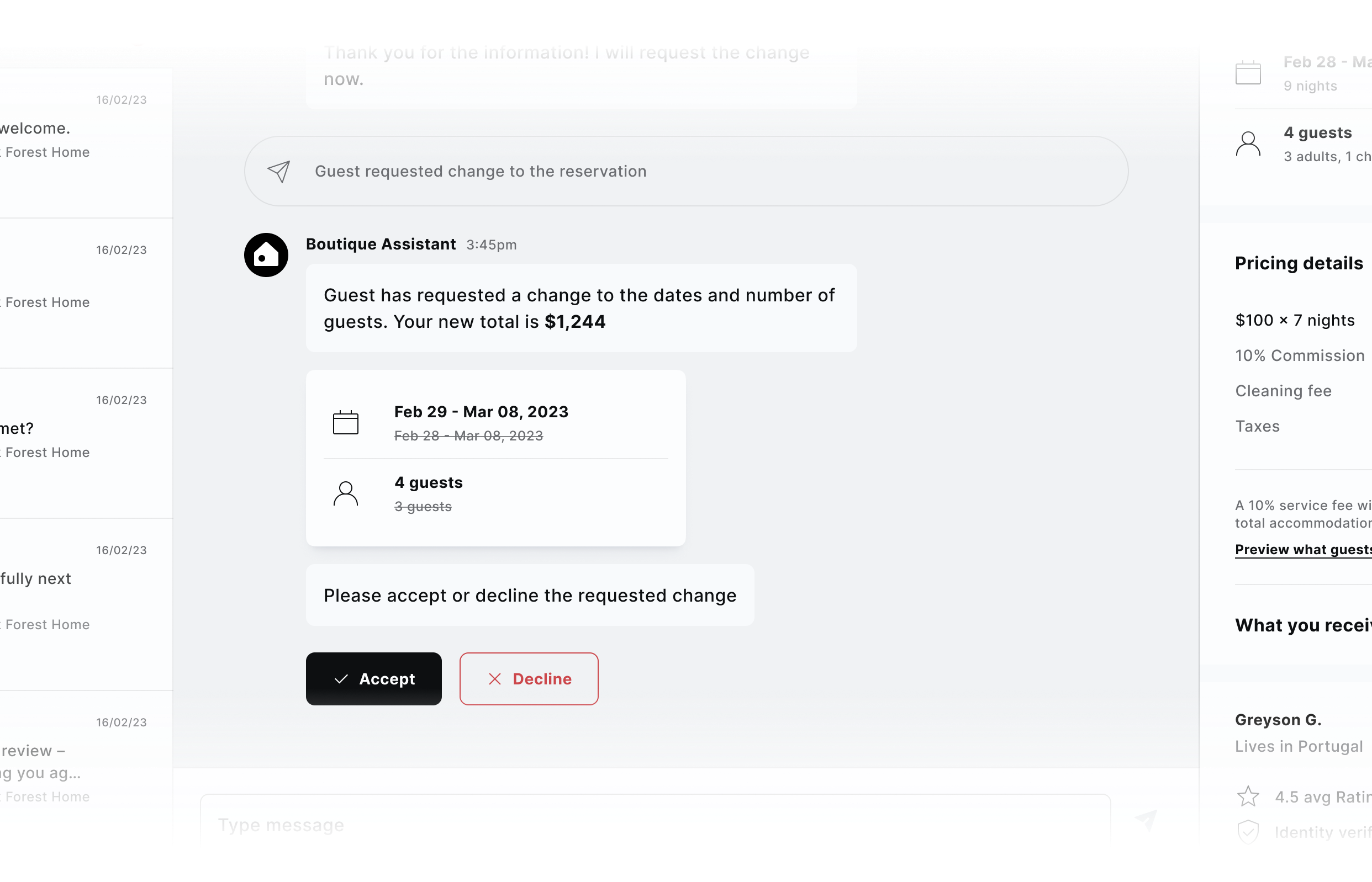
Easy changes, thoughtful cancellations
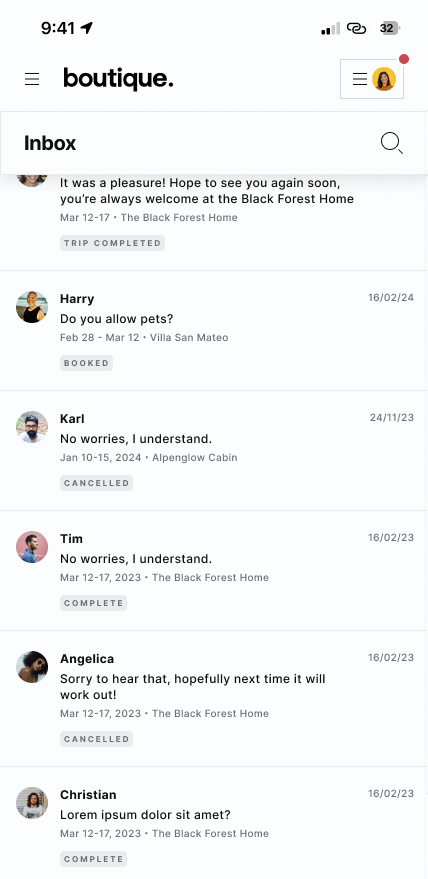
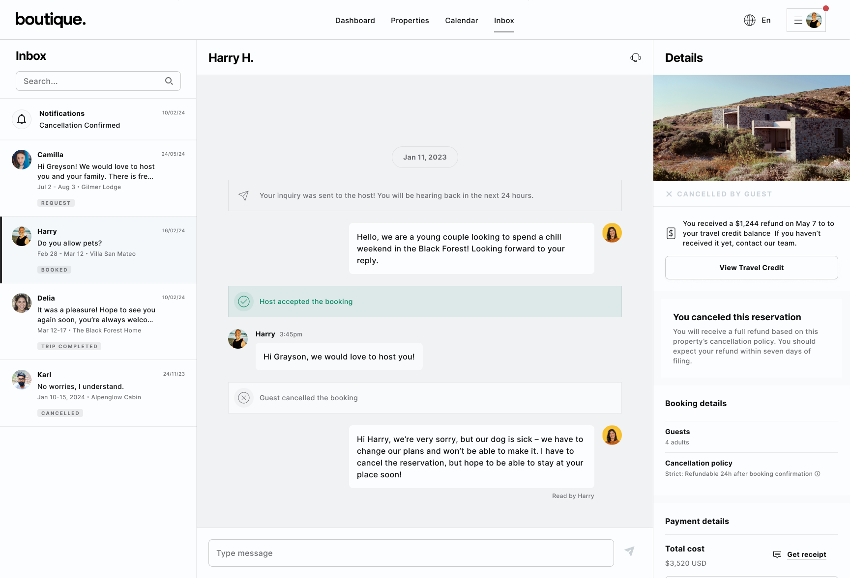
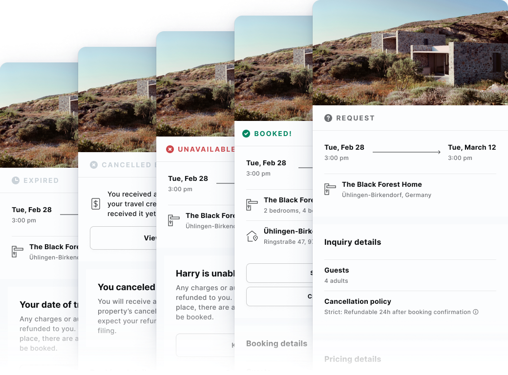
Across all booking stages
What we accomplished
What were our challenges?
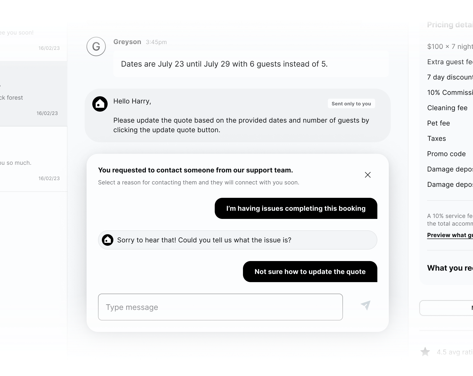
First look
How did we handle it?
What did it look like in the end?